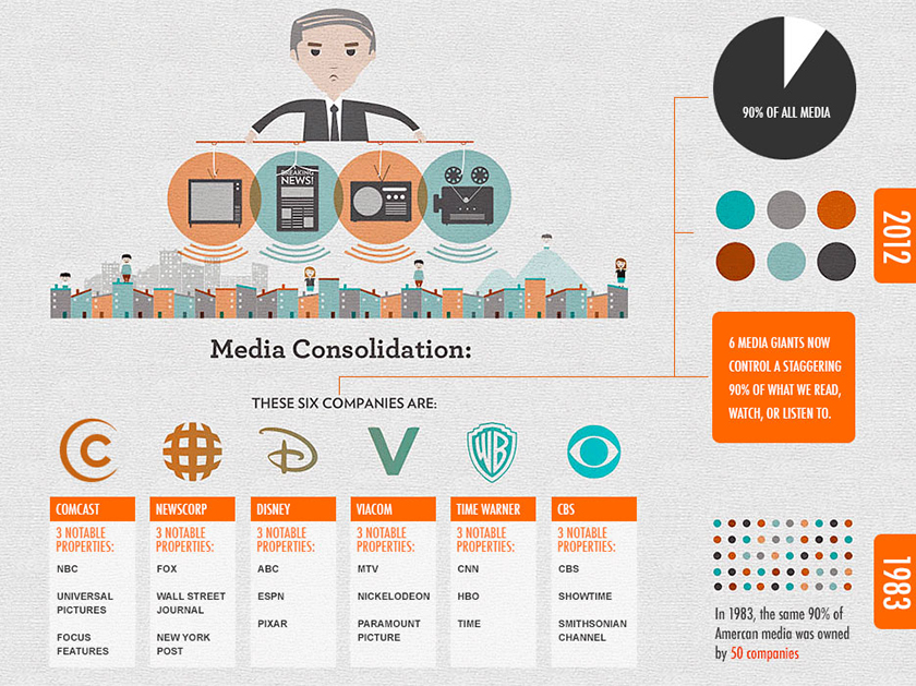
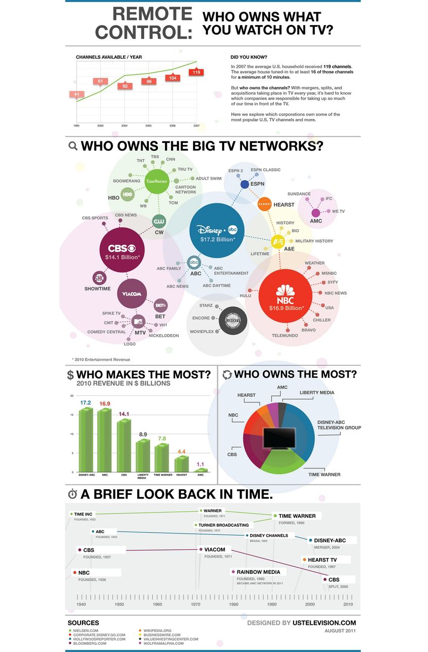
We could go on arguing which brand of coffee is the best, or which TV channel has the funniest sitcoms. But it will all just be in vain because, apparently, those products are owned by only a handful of megacorporations. No matter what we buy, or subscribe to, or to whom we trust our finances, chances are – our money goes to the same people who own these major companies.
To prove that, here are 8 fascinating infographics that spill the beans on who owns the world’s major brands!
1. Consumer goods
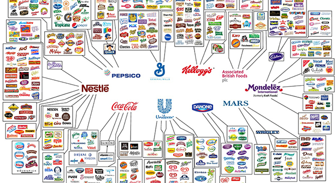
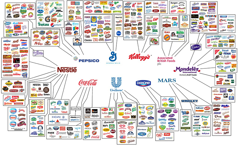
Oxfam International published this infographic as part of a report on the environmental and social responsibility of the “Big 10” food and beverage companies. This graph depicts that the huge amount of food brands are owned by very few major companies.
via Forbes
2. Beer
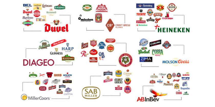
You’ll be surprised as to just how big the people backing your “small-batch brewery buzz” actually are. Surprisingly, this makes local brewery beers all the more special.
via Gizmodo
3. Cars
via Gizmodo
4. Airlines
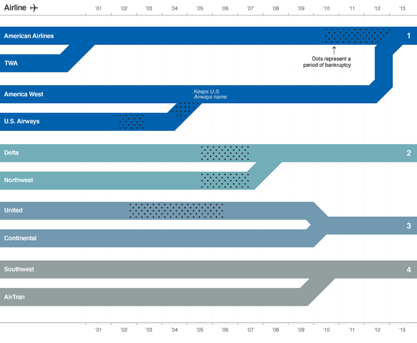
“A series of bankruptcies and mergers over the last 12 years has taken what had been 10 major U.S. airlines down to four mega-carriers which dominate the market.”
money.cnn.com
5. Financial Assets
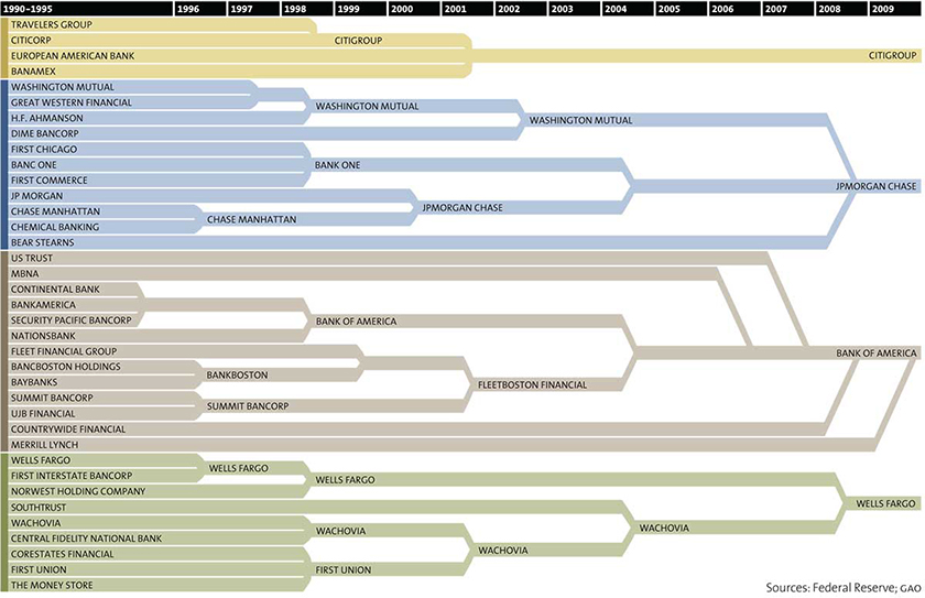
“Our money is all in the hands of a few megacorporations too. Here’s all the stuff that merged into Citigroup, JP Morgan Chase, Bank of America, and Wells Fargo since 1996. Now, according to MotherJones, 54% of all the financial assets in the United States are owned by just 10 institutions.”
via Mother Jones
6. Studios and media companies
via Musings From Meg O’Connor
7. TV Channels
via Pinterest
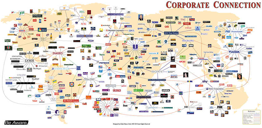
8. Everything else
This graphic is from 2003 but it shows all the connections between all brands, from liquor to clothing to music labels.
Be Aware

